Performance Measurement
Is Evolution Index The Most Undervalued Metric (Not) On Your Dashboard?
Data to Action
In a recent client review, we were walking through a brand's sales performance dashboard when the Sales Director paused at the line showing % market share. It had just started to slide. The room went a bit quiet.
What surprised me was nobody mentioned another metric — Evolution Index, which we subsequently highlighted had been trending down for several months prior. Nobody had been watching it. The brand had been losing momentum since well before the headline number showed the decline.
This is not unusual. In many pharma organisations, % market share is a headline metric. Evolution Index either sits quietly in a side column doing the most useful work on the page — or, just as often, isn't being calculated and reported at all. Two different starting points, but the same fix at the end of it. In this article I want to walk through why I think Evolution Index is the single most undervalued metric in commercial pharma analytics, how a few small changes to how you calculate and display it turn it into a genuine leading indicator of sales performance, and how the metric needs to land at the Rep and First Line Manager level — not just in the SLT pack.
What Evolution Index actually tells you
Evolution Index (EI) is the ratio of your brand's growth rate over a period divided by the market's growth rate over the same period, multiplied by 100.
Evolution Index = (Brand Growth % ÷ Market Growth %) × 100
- EI > 100 → Your brand is growing faster than the market. You are gaining share.
- EI = 100 → You are tracking the market. Share is flat.
- EI < 100 → The market is outpacing you. You are losing share, even if your absolute sales are up.
That last point is the one that catches people out. A brand can be growing absolute sales in a fast-growing TA and still be quietly bleeding share to a competitor. EI converts an absolute number into a competitive number, and that is what makes it more useful than market share on its own.
How to read the leading indicator relationship
Plot RQTR EI and RQTR Market Share on the same chart and two patterns repeat themselves over and over:
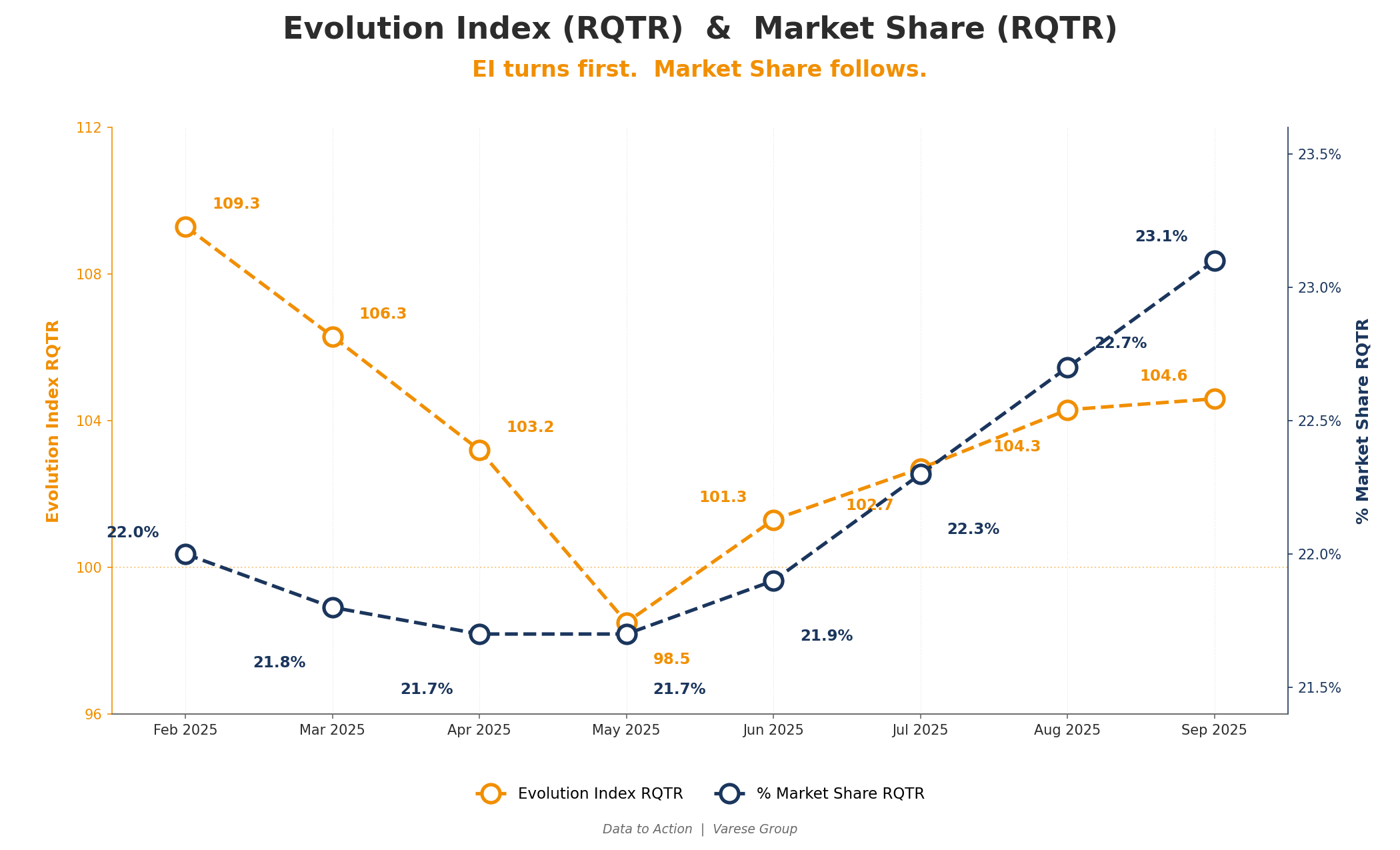
From February to April, E.I. was clearly in steep decline and could be projected to dip below 100 by May, indicating Market Share would be negatively impacted. The warning signs were clear to see!
EI trend is the early indicator of market share change. EI (RQTR) is comparing two 3-month windows that are 3 months apart, so it sees the shift in trajectory forewarning your market share change.
The rule for managers: EI declining towards 100 is a warning. EI improving towards (or above) 100 is an opportunity. Both should change how you allocate effort in the next operating cycle.
Where it gets actionable — the 2 X 2 Bubble chart
The line chart tells you what is happening overall. The bubble chart tells you where it is happening.
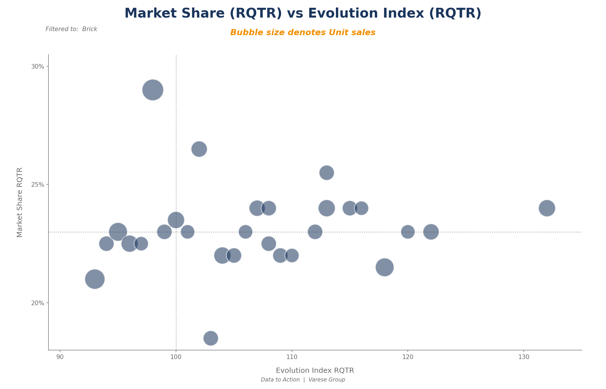
Plot each Geography as a 2X2 Bubble Chart, current market share (RQTR) (Y axis) and E.I. (RQTR) (X axis). Bubble size denotes Unit (or $) Sales.
Plot every Brick (or Territory, SRA, region — whichever level you manage at) on a scatter graph:
- X axis → RQTR Evolution Index
- Y axis → RQTR Market Share
- Bubble size → Brand units or $ sales
You now have four quadrants and a different management response for each one:
- Top-left (high share, EI < 100) — Defend. Crown jewels starting to slip. Highest-leverage intervention on the page.
- Top-right (high share, EI > 100) — Protect. Strongholds still winning. Codify what is working. Use as case studies.
- Bottom-left (low share, EI < 100) — Diagnose. Losing on both axes. Structural issue or coverage gap? Do not pour resource in blind.
- Bottom-right (low share, EI > 100) — Invest. Risers gaining momentum from a low base. Disproportionate effort earns disproportionate return.
Bubble size also helps set your priority across the geography you are visualising. A large geography (e.g. SRA) that is slipping matters more than a small geography that is improving.
In PowerBI (or your reporting platform of choice), this becomes an operating workflow rather than just a report. Click any bubble — say a brick that appears in your top-left "defend" quadrant — and the EI/MS trend chart on the same page filters down to just that brick's history. You see when the trend started, how steep it is, and whether it is a wobble or a sustained move. Ten seconds of clicking replaces what used to be three reports and a half-hour conversation.
Why RQTR is better than MAT for an operating cadence
MAT is too slow to show trend changes for sales managers. By the time MAT EI has dipped below 100, the underlying decline has been in motion for six months. You have already lost ground that will take another six to claw back.
The Rolling Quarter (RQTR) benefits are practical:
- Earlier signal. RQTR EI will cross 100 a couple of months before MAT EI does. In a competitive market that is the difference between defending share and explaining its loss.
- Aligned with sales operating cycles. Most field teams plan and review monthly or quarterly. RQTR matches that rhythm.
- Works at any level of granularity. Brick, Territory, SRA, Region or National — same metric, same interpretation, drillable from one level to the next.
EI data refreshes monthly — the underlying market data does not move faster than that. But the use of the metric runs at three different rhythms depending on where you sit in the organisation.
Brand team — monthly. Review First Line Manager variance. Where are the patterns? Which FLMs are showing EI increase or decline? Who is ahead or behind the National performance? The unit of analysis here is the FLM, not the territory — because the territory's performance is, ultimately, the FLM's coaching output. Promotional investment decisions, resourcing conversations, and where to send Brand attention all flow from this view.
First Line Manager — fortnightly. On territory with each Rep once every two weeks. The expectation in that field visit is that the Rep understands their own territory performance from SRA down to Brick — which bricks are turning, which are stable, which are bleeding share. The FLM's job is to coach the Rep into reading EI and MS together and using them to shape the next round of call planning.
Sales Rep — weekly. Each Rep is worked on a weekly SRA rotation. Before working an SRA, the Rep reviews the bricks in their upcoming rotations — pulling the EI / MS view at the brick level, identifying which bricks sit in which quadrant and how they are trending relative to recent promotional activity, and shaping future call planning accordingly.
The metric is the same at every level. What changes is the unit of analysis and the frequency. And critically — this only works if Reps and FLMs are trained to read it. EI is a leading indicator, but only if the people in the field are actually reading the leading edge. Promoting RQTR EI to a headline metric in the Brand team's monthly review without training the field force to use it is a half-implementation that produces zero behavioural change.
What to do this quarter
The shift worth making depends on where you start.
If your dashboard already shows RQTR Evolution Index: the data is there, it just is not being used. Train Reps and FLMs to read it. Make EI a standing element of every fortnightly field-visit conversation. Promote it from "side column" to the lens through which territory variance is discussed at every level — Brand team monthly, FLM fortnightly, Rep weekly.
If your dashboard does not yet show RQTR EI: get it on. Brand-level EI on MAT alone is no longer enough. Ask Commercial Operations for RQTR EI at every level of granularity — Brick, SRA, Territory, FLM, Region, National — drillable from one to the next. Then go through the training step above. If you need support building or deploying these dashboards, that is exactly the kind of work Varese Group does — happy to talk.
For everyone: stop treating Evolution Index as a metric "for the board pack." The board pack can keep MAT. Your operating cadence — Brand team monthly, FLM fortnightly, Rep weekly — should be steering on RQTR EI.
What next?
In my next article in this series I will pick up from here and overlay promotional interaction metrics against the sales outcome metrics introduced above. That is where leading meets leading, and where you can actually answer whether your activity is causing the share movement or whether you are just lucky (or unlucky!).
If you would like to better understand the concepts outlined here and more, feel free to reach out to Varese Group.
Loading comments…